Using LVGL and TFT on the Seeed Studio Round Display for all XIAO series
Thank you for purchased Seeed Studio Round Display products. In this section of the tutorial, we will focus on how to use the Seeed_GFX library and LVGL library to draw various rich and interesting dial patterns on the Round Display, and introduce the usage of some common functions of these two useful but complex libraries from simple to deep. Through the content of this tutorial, I hope you can use this product to draw your ideal dial pattern. Have a great learning experience!
Getting Started
Before you enter the study, we would like you to be prepared for the following.
Hardware Preparation
For demonstration purposes, this tutorial will use the XIAO ESP32S3 as the master control.
| Seeed Studio Round Display for XIAO | Seeed Studio XIAO ESP32S3 |
|---|---|
 |  |
If you want to use other XIAO products, the tutorials and methods in this article are also applicable.
| Seeed Studio XIAO SAMD21 | Seeed Studio XIAO RP2040 | Seeed Studio XIAO nRF52840 (Sense) | Seeed Studio XIAO ESP32C3 |
|---|---|---|---|
 |  |  |  |
When installing the XIAO with Round Display, please let the XIAO's Type-C connector face the outside of the Round Display, and then connect each pin against the dual 7-pin headers.
Software Preparation
This part has been described in detail in the Basic Wiki, so you can jump directly to read it.
Drawing simple dials using the Seeed_GFX library
Seeed_GFX (Based on modifications to the TFT_eSPI library, with deep support for Seeed's display products) is a feature rich Arduino IDE compatible graphics and fonts library for 32 bit processors. The TFT library provided by the XIAO Round Display is based on the library after the compatibility of XIAO and XIAO Round Display, which supports the use of the whole series of XIAO.
Common Interfaces for TFT Library
1. Create TFT objects
TFT_eSPI tft = TFT_eSPI()
TFT_eSPI tft = TFT_eSPI(240,240)        // Set the screen size at the time of object creation
2. Initialization
void init(uint8_t tc = TAB_COLOUR)
void begin(uint8_t tc = TAB_COLOUR)
tft.begin() and tft.init() are two functions with the same function.
3. Clear screen
void fillScreen(uint32_t color) // Fill the screen with a certain color
4. Setting the screen orientation
void setRotation(uint8_t r);      // Set the display image rotation direction, r optional parameters for 0, 1, 2, 3
uint8_t getRotation(void)         // Read the current rotation angle
0, 1, 2, 3 represent 0°, 90°, 180°, 270°. Respectively, and 4 is the mirror image.
5. Color Conversion
uint16_t color565(uint8_t red, uint8_t green, uint8_t blue)    // Convert 8-bit red, green and blue to 16-bit
uint16_t color8to16(uint8_t color332)                          // Convert 8-bit color to 16-bit
uint8_t  color16to8(uint16_t color565)                         // Convert 16-bit color to 8-bit
uint32_t color16to24(uint16_t color565)                        // Convert 16-bit color to 24-bit
uint32_t color24to16(uint32_t color888)                        // Convert 24-bit color to 16-bit
6. Color reversal
void invertDisplay(bool i) //i = true to invert all display colors, i = false to display normally
7. Text-related settings
/* cursor */
void setCursor(int16_t x, int16_t y)                     // Set the cursor for tft.print()
void setCursor(int16_t x, int16_t y, uint8_t font)       // Set the cursor and font size of tft.print()
int16_t getCursorX(void)                                 // Read the current cursor x position (moves with tft.print())
int16_t getCursorY(void)                                 // Retrieve the current cursor y position

/* font color */
void setTextColor(uint16_t color)                        // Set the color of characters only
void setTextColor(uint16_t fgcolor, uint16_t bgcolor, bool bgfill = false)   // Set the character foreground and background colors

/* font size */
void setTextSize(uint8_t size)                           // Set the character size multiplier (this increases the pixel size)
void setTextWrap(bool wrapX, bool wrapY = false)         // Turn on/off line feeds for text in TFT width and/or height

/* Text reference position */
void setTextDatum(uint8_t datum)                         // Set text reference position (default is top left corner)
uint8_t getTextDatum(void)                               // Get the text reference position

/* Set the background fill, which can be used to clear the display of the specified area */
void setTextPadding(uint16_t x_width)                    // Set the text fill (background margin/rewrite) width in pixels
uint16_t getTextPadding(void)                            // Get text fill
As you can see from the above functions, if you want to print the displayed text, you can simply use the tft.print() function.
8. Drawing of simple shapes
You can draw some simple shapes, including pixel points, straight line segments, rectangles, circles, etc. by using the following functions.
drawPixel(int32_t x, int32_t y, uint32_t color)    // Plotting individual pixel points

drawLine(int32_t xs, int32_t ys, int32_t xe, int32_t ye, uint32_t color)  // Draw a line

drawRect(int32_t x, int32_t y, int32_t w, int32_t h, uint32_t color)   // Draw a rectangle
fillRect(int32_t x, int32_t y, int32_t w, int32_t h, uint32_t color)  // Draw a rectangle with a fill color

drawCircle(int32_t x, int32_t y, int32_t r, uint32_t color)  // Draw a circle
fillCircle(int32_t x, int32_t y, int32_t r, uint32_t color)  // Draw a circle with a fill color

drawEllipse(int16_t x, int16_t y, int32_t rx, int32_t ry, uint16_t color)  // Draw a ellipse
fillEllipse(int16_t x, int16_t y, int32_t rx, int32_t ry, uint16_t color)  // Draw a ellipse with a fill color

drawTriangle(int32_t x1,int32_t y1, int32_t x2,int32_t y2, int32_t x3,int32_t y3, uint32_t color)  // Draw a triangle
fillTriangle(int32_t x1,int32_t y1, int32_t x2,int32_t y2, int32_t x3,int32_t y3, uint32_t color)  // Draw a triange with a fill color
9. Drawing of complex shapes
The TFT library also provides us with methods for drawing complex shapes, such as rounded rectangles, rounded arcs, silky smooth shapes, etc.
/**
    Draw a pixel blended with the background pixel colour (bg_color) specified,  return blended colour
    If the bg_color is not specified, the background pixel colour will be read from TFT or sprite
**/
drawPixel(int32_t x, int32_t y, uint32_t color, uint8_t alpha, uint32_t bg_color)

/**
    Draw a small anti-aliased filled circle at ax,ay with radius r (uses drawWideLine)
    If bg_color is not included the background pixel colour will be read from TFT or sprite
**/
drawSpot(float ax, float ay, float r, uint32_t fg_color, uint32_t bg_color)


drawFastVLine(int32_t x, int32_t y, int32_t h, uint32_t color)  // Draw vertical straight lines
drawFastHLine(int32_t x, int32_t y, int32_t w, uint32_t color)  // Draw horizontal lines
drawWideLine(float ax, float ay, float bx, float by, float wd, uint32_t fg_color, uint32_t bg_color)  // Draw a thick solid line
drawWedgeLine(float ax, float ay, float bx, float by, float aw, float bw, uint32_t fg_color, uint32_t bg_color);  //Draws a tapered line. aw and bw represent the start and end width of the tapered line, respectively.


/**
    As per "drawSmoothArc" except the ends of the arc are NOT anti-aliased, this facilitates dynamic arc length changes with arc segments and ensures clean segment joints.
    The sides of the arc are anti-aliased by default. If smoothArc is false sides will NOT be anti-aliased
**/
drawArc(int32_t x, int32_t y, int32_t r, int32_t ir, uint32_t startAngle, uint32_t endAngle, uint32_t fg_color, uint32_t bg_color, bool smoothArc);

/**
    Draw an anti-aliased (smooth) arc between start and end angles. Arc ends are anti-aliased.
    By default the arc is drawn with square ends unless the "roundEnds" parameter is included and set true
    Angle = 0 is at 6 o'clock position, 90 at 9 o'clock etc. The angles must be in range 0-360 or they will be clipped to these limits
    The start angle may be larger than the end angle. Arcs are always drawn clockwise from the start angle.
**/
drawSmoothArc(int32_t x, int32_t y, int32_t r, int32_t ir, uint32_t startAngle, uint32_t endAngle, uint32_t fg_color, uint32_t bg_color, bool roundEnds);

/**
    Draw an anti-aliased filled circle at x, y with radius r
    Note: The thickness of line is 3 pixels to reduce the visible "braiding" effect of anti-aliasing narrow lines this means the inner anti-alias zone is always at r-1 and the outer zone at r+1
**/
drawSmoothCircle(int32_t x, int32_t y, int32_t r, uint32_t fg_color, uint32_t bg_color)

/**
    Draw an anti-aliased filled circle at x, y with radius r
    If bg_color is not included the background pixel colour will be read from TFT or sprite
**/
fillSmoothCircle(int32_t x, int32_t y, int32_t r, uint32_t color, uint32_t bg_color)


/**
    Draw a rounded rectangle that has a line thickness of r-ir+1 and bounding box defined by x,y and w,h
    The outer corner radius is r, inner corner radius is ir
    The inside and outside of the border are anti-aliased
**/
drawSmoothRoundRect(int32_t x, int32_t y, int32_t r, int32_t ir, int32_t w, int32_t h, uint32_t fg_color, uint32_t bg_color, uint8_t quadrants)

/**
    Draw a filled rounded rectangle , corner radius r and bounding box defined by x,y and w,h
**/
fillSmoothRoundRect(int32_t x, int32_t y, int32_t w, int32_t h, int32_t radius, uint32_t color, uint32_t bg_color)
10. Variables and text
In addition to simply displaying a specific string, sometimes we need to display some variables on the screen, such as time and sensor values, etc. Then, depending on the type of the variable, you can choose to use the following different functions.
drawChar(int32_t x, int32_t y, uint16_t c, uint32_t color, uint32_t bg, uint8_t size)
drawNumber(long intNumber, int32_t x, int32_t y, uint8_t font) // Draw integer using specified font number. If no font is set (the last parameter, the default font)
drawFloat(float floatNumber, uint8_t decimal, int32_t x, int32_t y, uint8_t font), // Draw float using specified font number. If no font is set (the last parameter, the default font)
drawString(const char *string, int32_t x, int32_t y, uint8_t font),  // Draw string using specified font number. If no font is set (the last parameter, the default font)
11. Image Processing
To use the pushImage() function to display an image on screen with the TFT library, you can follow these steps:
-
Convert the image file to a C/C++ array format that Arduino can recognize. You can use online tools such as Image2CPP to convert a bitmap image to an array format.
-
Include the generated image array file in your Arduino program.
-
Initialize the TFT library and screen, set the screen resolution and color mode.
-
Use the
tft.pushImage(x, y, width, height, data)function to push the image data to the screen, where x and y are the coordinates of the top-left corner of the image, width and height are the width and height of the image, and data is the image array.
// Image data array
const unsigned char image_data[] PROGMEM = {
  // Insert the converted C/C++ array data of the image here
};

tft.pushImage(x, y, image_width, image_height, image_data);
12. TFT_eSprite class
TFT_eSprite and TFT_eSPI are both Arduino libraries for TFT LCD displays, but they have different functions and design purposes.
TFT_eSPI is a powerful library with many advanced features and configuration options that can achieve various display effects. It supports multiple display driver chips and controllers, and can be used on multiple Arduino hardware platforms. It uses the SPI interface and highly optimized code to achieve fast refresh rates and small code footprint. The TFT_eSPI library can be used for various applications including games, graphics, and GUI.
TFT_eSprite is a complement to the TFT_eSPI library and is mainly used for drawing small sprites on the display, such as game characters, icons, text, etc. TFT_eSprite can achieve faster drawing speeds because it caches images in memory and performs partial refreshes. This allows for faster refresh rates when updating small sprites and can save processor time and memory space.
Therefore, TFT_eSPI is a powerful general-purpose library suitable for multiple applications, while TFT_eSprite is a library that focuses on drawing small sprites and can provide higher drawing efficiency.
The general format for using the TFT_eSPI library is as follows.
#include <TFT_eSPI.h>

TFT_eSPI tft = TFT_eSPI();

void setup() {
  tft.init();
  tft.setRotation(1);
}

void loop() {
    // Write the code to draw the graph
}
The general format for using the TFT_eSprite library is as follows.
#include <TFT_eSPI.h>

TFT_eSPI tft = TFT_eSPI();
TFT_eSprite spr = TFT_eSprite(&tft);

void setup() {
  tft.init();
  tft.setRotation(1);
}

void loop() {
    spr.createSprite(128, 128);  // Create a sprite of 128*128 size

    // Write the code to draw the graph

    spr.pushSprite(0, 0);  // Placement of the drawn sprite
    spr.deleteSprite();
}
In the above example code, when the program exits the loop() function, spr.deleteSprite(); is called to delete the TFT_eSprite object and release the memory space. This way, when creating a TFT_eSprite object in the next loop, the previously released memory space can be used to avoid wasting memory resources.
For more information about the TFT library functions and its use, we recommend reading the TFT_eSPI.h and TFT_eSPI.cpp files in the library.
About the TFT library customization options
Sometimes we need to use some custom font libraries or some features that are not enabled to save space. At this point we will need to modify the contents of the Setup66_Seeed_XIAO_Round.h file.
- The default path for this file on Windows systems is:
C:\Users\{UserName}\Documents\Arduino\libraries\Seeed_GFX\User_Setups\Setup66_Seeed_XIAO_Round.h
- The default path for this file on MacOS systems is:
\Users\{UserName}\Documents\Arduino\libraries\Seeed_GFX\User_Setups\Setup66_Seeed_XIAO_Round.h
Please turn on or off some unnecessary functions according to the actual usage.
For example, if you want to use custom fonts, then you should uncomment #define SMOOTH_FONT, otherwise, you will probably get errors when running.
Of course, the header files of your custom fonts should be saved in the same directory as the ino files, which is a necessary step to circumvent errors.
TFT-based dial sample program
We have written a dial program for the Round Display that can be used directly. Due to the memory space limitation of some XIAO models, this program only performs the basic hand movement function and is not designed for other functions. Users can use this program to learn the use of TFT library and the function of pointer movement, and complete the development of more complex dials according to the actual situation.
Drawing simple dials using the LVGL library
The LVGL library is a general-purpose embedded graphics library that offers a rich set of graphical user interface controls such as buttons, labels, lists, etc. that can be used to build various user interfaces. Unlike the TFT library, the LVGL library provides an abstracted, object-oriented graphics interface that is easier to use and maintain, but may come with some performance and reliability trade-offs.
LVGL library is a very useful tool when building complex user interfaces that reduce the workload of writing and maintaining code. The TFT library, on the other hand, is more suitable for some applications that require high-performance graphics such as real-time image processing, video rendering, etc.
Common Interfaces for LVGL Library
The LVGL library API is very rich and complex, and we hope that everyone who uses LVGL will take the time to read the official LVGL introduction documentation.
Drawing complex UI interfaces with SquareLine Studio
In addition to reading the extensive LVGL official documentation and writing our own LVGL graphics programs, we can also use the official LVGL SquareLine Studio tool to improve our development efficiency.
Next, we will give you a brief introduction to the use of the software on the round screen, configuration methods, to help you can quickly get started using the software to design some interfaces.
We recommend you to use the v1.5.1 version of SquareLine Studio. This is also the latest software version at the time of writing this Wiki.
Environment used in the preparation of this tutorial:
-
Seeed_GFX library by Bodmer, modified by Seeed Studio.
-
SeeedStudio_lvgl library by kisvegabor, embeddedt, pete-pjb, modified by Seeed Studio.
Step1. Download the SuqareLine Studio
You can go to the official website of SquareLine Studio by clicking here, then click TRY IT FOR FREE to download the software to your computer.
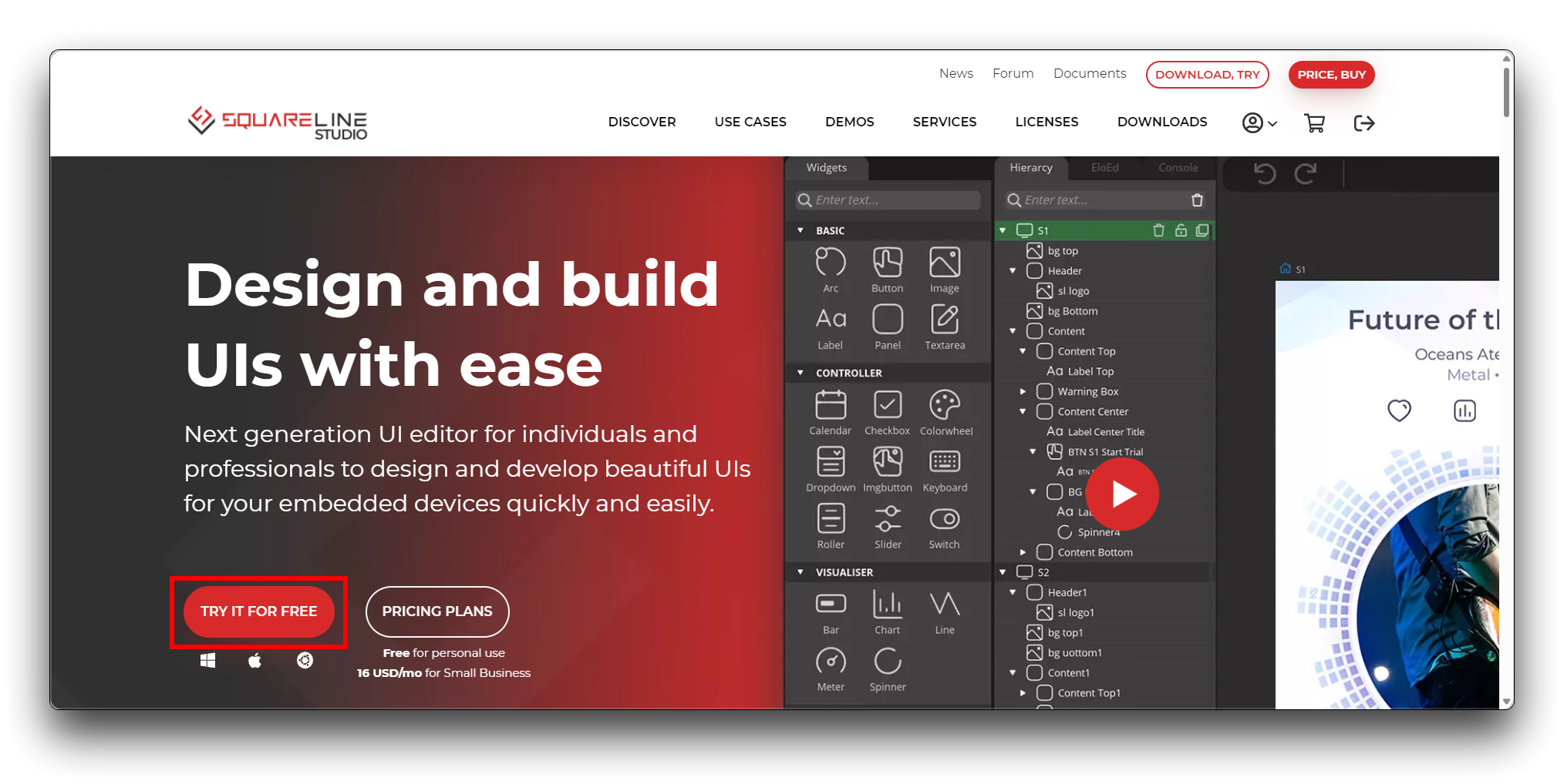
If your computer is using this software for the first time, then you will get a free 30-day trial, if not, the free version is also able to draw up to 5 pages, using 50 widgets.
If you're a first-time user, please don't register to log into your account that has no balance, it could cost you the full 30-day trial!
Step2. Configure screen interface information
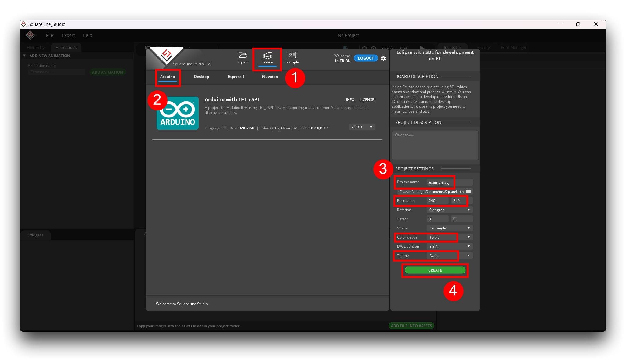
Next, we can open the software and start by creating a blank display page.
Since we are using Arduino programming, then what we create also needs to be an Arduino file.
Our circular screen has a screen resolution of 240*240 and supports only 16bit color depth. Other than that, the name and theme of the project need to be defined by you, here I'll use the dark style as the theme.
What if you're too fast, like me, and forget to set the shape of the dial and create the project? No problem, in the upper left corner of the main interface, you can also find the Project Settings tab to make changes to the settings you just made.
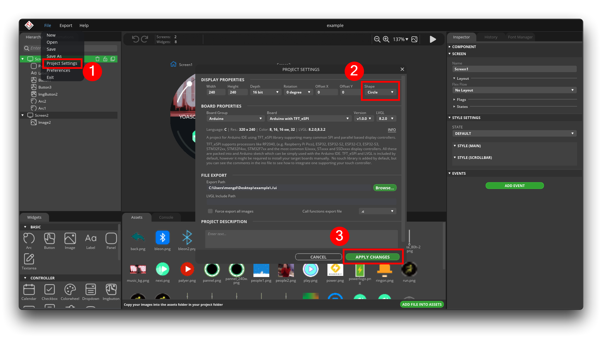
Note that please complete your project setup before you officially start drawing and make sure it matches our screen specifications, otherwise everything you draw may not display properly on the screen.
Not everything can be modified after the project has been created, such as the project name. Please don't use any language other than English or special characters in the project name, and please don't use the "-" sign, please replace the "-" sign with "_". Otherwise, the exported program may have errors during compilation!
Step3. Understanding the functional layout of the software
Based on my usage habits, I have divided the main interface of the software into roughly the following parts.
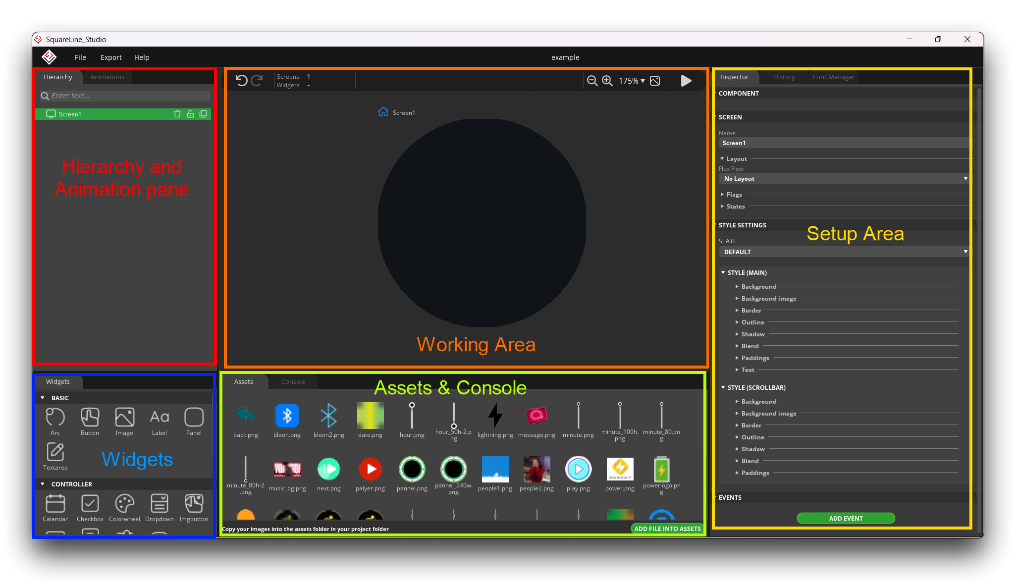
-
Hierarchy and Animation pane: This one area allows you to set up different dial pages, display layers and animations.
-
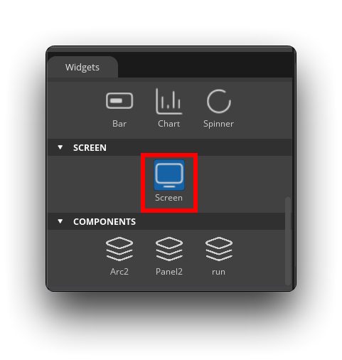
Widgets: Here you can choose what components to use to add on the display page. These components are integrated with the software and can be used directly. Components that are not available here will need to be added later in your own programming software.
-
Working Area: In the workspace, you can change the position of certain components by dragging and dropping them. Even more conveniently, the final display will be consistent with what is shown in the workspace, so what you see is what you get.
-
Assets & Console: Assets shows the image clips you have added, and these added image clips can be used in the components that support inserting images. Console will show you some error messages (if any) that occurred while setting up.
-
Setup Area: The main purpose here is to configure the properties of the component.
We will first have a general knowledge of the software interface, and then we will take you through the practical understanding of the use of each part.
Step4. Use software to realize your ideas
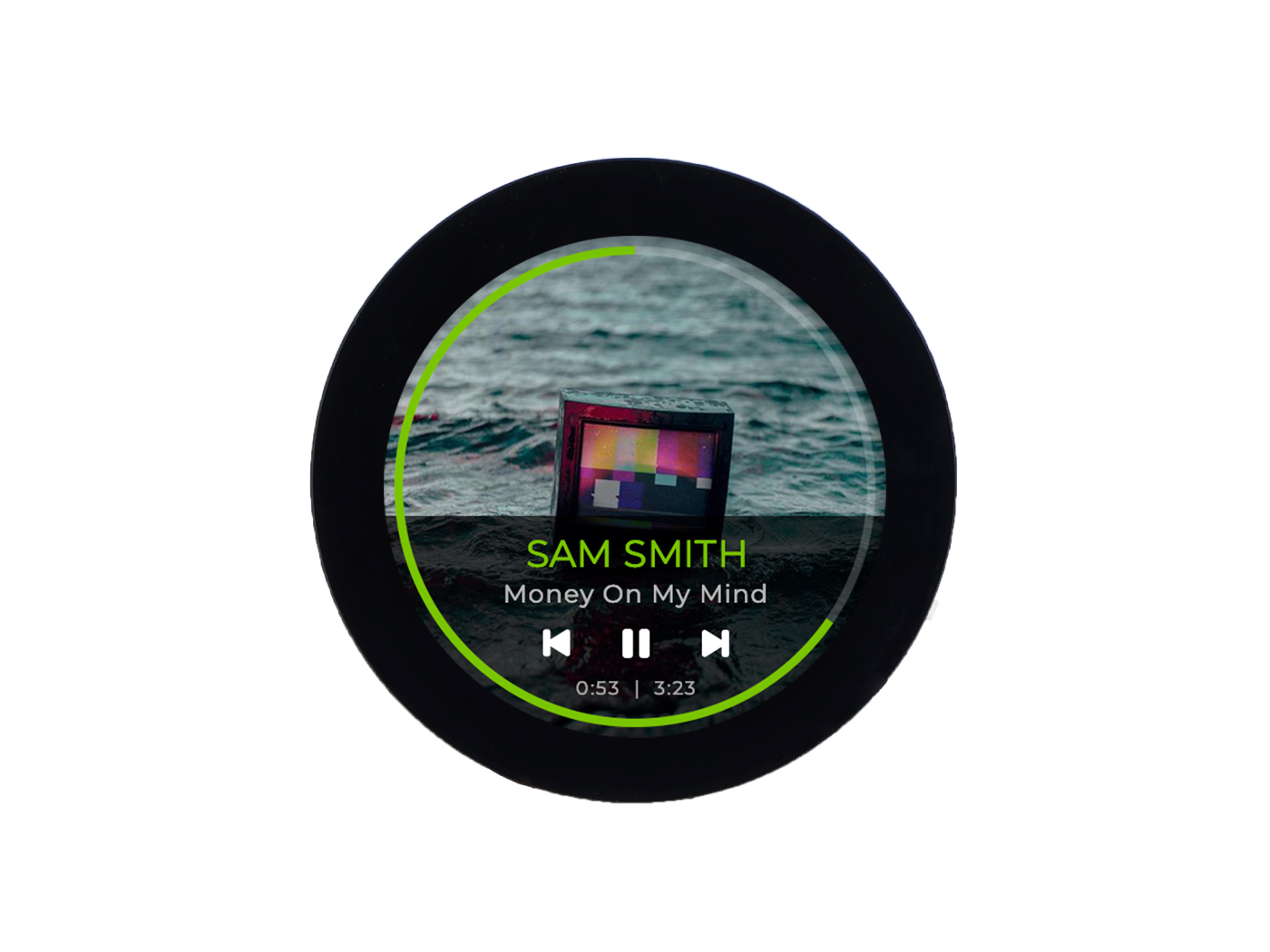
Suppose I want to draw a music interface now. Of course, I like listening to music too much, so I want to draw a music display interface as an example.
I would like to have the following components in this music display screen.
- Album cover art of my favorite music as background.
- To have a play progress bar
- To have a volume control bar
- To have a play and pause button
After sorting out our requirements, we then need to design the display components from the bottom up, just like building a building.
The first step is to create a musical background image.
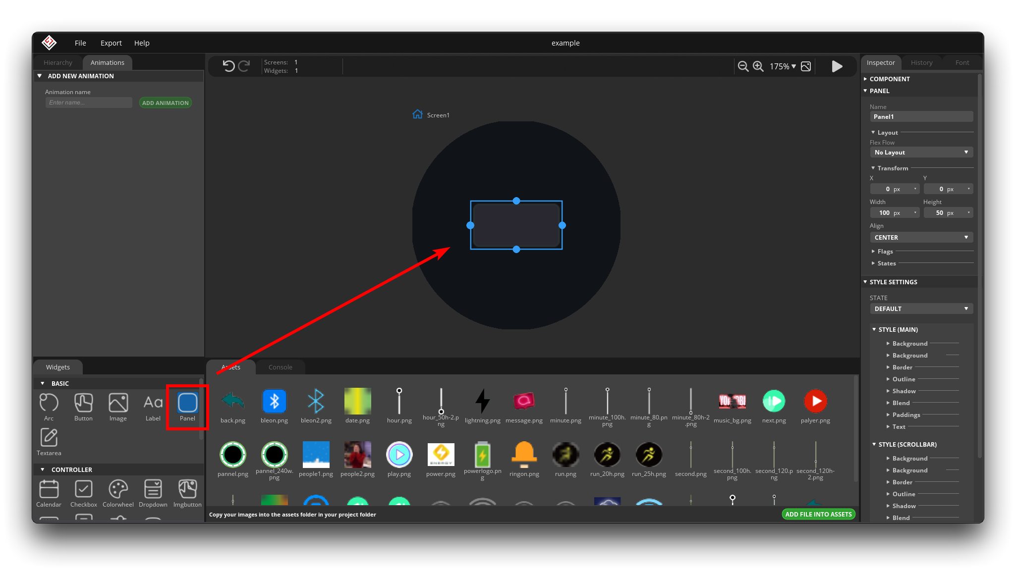
Select Panel in the widgets, you can click it and it will be automatically placed in the center of the dial, or you can drag it to the position of the dial you want to place it.
We will put the displayed image in the Panel instead of directly on the dial background because I don't like the whole dial to be this image, and the Panel can be resized freely.
At this point, you can see that there are already a series of properties in the Setup Area that we can set. The settings for each component are generally similar, with one or two options that may be a little different.
Name: You should name the widget. There cannot be a number, underscore or a special character at the beginning of the name. Having exported the code, you can find the widget by that name.
Layout: You can use a layout to automatically arrange the children of a widget. If the layout is enabled the children's X and Y value can't be adjusted manually, unless the
IGNORE_LAYOUTor theFLOATINGflag is enabled on the children.
Main Flags
- Hidden - Make the object hidden. (Like it wasn't there at all.)
- Clickable - Make the object clickable by input devices
- Click focusable - Add focused state to the object when clicked
- Checkable - Toggle checked state when the object is clicked
- Snappable - If scroll snap is enabled on the parent it can snap to this object
- Press lock - Keep the object pressed even if the press slid from the object
- Event bubble - Propagate the events to the parent too
- Gesture bubble - Propagate the events to the parent too
- Adv hittest - Allow performing more accurate hit (click) test. E.g. accounting for rounded corners
- Ignore layout - Make the object positionable by the layouts
- Floating - Do not scroll the object when the parent scrolls and ignore layout
Scroll Flags
- Scrollable - Make the object scrollable
- Scroll elastic - Allow scrolling inside but with slower speed
- Scroll momentum - Make the object scroll further when "thrown"
- Scroll one - Allow scrolling only one snappable children
- Scroll chain - Allow propagating the scroll to a parent
- Scroll on focus - Automatically scroll object to make it visible when focused
Scroll Settings
- Scroll direction - Scrollbars are displayed according to a configured
- Scrollbar mode - Scrollbars are displayed according to a configured mode. The following modes exist:
- Off - Never show the scrollbars
- On - Always show the scrollbars
- Active - Show scroll bars while a object is being scrolled
- Auto - Show scroll bars when the content is large enough to be scrolled
States: The object can be in a combination of the following states:
- Clickable - Toggled or checked state
- Disable - Disabled state
- Focusable - Focused via keypad or encoder or clicked via touchpad/mouse
- Pressed - Being pressed
Style settings: Styles can be used to add effects to widgets or their parts. You can add a custom background color, border, shadow, etc. In Style Settings, you can add or modify the values of these parameters.
State: You can create a custom style to each state.
Style Properties: Style Properties are the parameters to be set for the styles.
- Arc: Arc Style can be used in those widgets which have the Arc component.
- Line color - The color of the line
- Arc width - The width of the arc
- Arc rounded - The ends of the arc line are rounded
- Arc image - The background image for the arc line
- Background: Background Style is the background of the widgets. You can create gradients or make the corners of the background rounded.
- Color and alpha - Set the background color and alpha of the object.
- Gradient color - Set the gradient color of the background.
- Bg main stop - Set the point from which the background color should start for gradients.
- Bg gradinet stop - Set the point from which the background's gradient color should start
- Bg radius - The radius you use to make the background corners rounded
- Gradient direction - The direction of the gradient. It can be horizontal or vertical.
- Clip corner - Enable to clip the overflowed content on the rounded corner.
- Background Image: You can set an image as a background image.
- Bg image - The image you use as a background image
- Bg image opa - The opacity of the background image
- Recolor - With Recolor function, you can use a color on the background image. Set the color depth by changing the alpha parameter.
- Bg image tiled - If enabled, background image will be tiled
- Blend: By using Blend Style, you can mix the pixel colors of the current widget part with the colors of the object followed by.
- Blend mode - Choose from four options.
- Normal - Default state
- Additive - Adding up pixels
- Subtractive - Subtract pixels
- Multiply - Multiply pixels
- Blend opacity - Here you can set the opacity of the widget part
- Border: Using Border, you can draw a border around the selected object onto the inner lines.
- Border color - The color of the border
- Border width - The width of the border
- Border side - The direction of the border
- Line: Line Style can be used in those widgets which have the Line component.
- Color - The color of the line
- Width - The width of the line
- Line rounded - The ends of the line will be rounded
- Outline: Outline style is similar to Border style but here you draw the border around the selected widget part.
- Outline color - The color of the outline
- Outline width - The width of the outline
- Outline pad - Distance from the side of the widget in pixels
- Paddings: Paddings style put a padding onto the widget part. It means parts under it in the hierarchy will shift by the distance defined in the padding with pixel values.
- Pad - The extent of the padding
- Shadow: Using a Shadow Style, you can draw a shadow or a glow to the selected widget part.
- Shadow color - The color of the shadow
- Shadow width - The width of the shadow
- Shadow spread - The depth of the shadow
- Shadow OX - Shift the shadow on the X axis
- Shadow OY - Shift the shadow on the Y axis
- Text: Text Style defines the parameters of the text that can be found on the widget.
- Text color - The color of the text
- Letter spacing - The space between the letters Line spacing - The space between the lines
- Text align - The direction of text alignment
- Text decor - You can overline or underline the text
- None - Normal text
- Understand - Underlined text
- Strikethrough - Overlined text
- Text font - The font of the text
Event Properties: Adding events, you can create different interactions to widgets, for instance change the screen, play an animation, etc. by pressing a button.
- Add Event: At the bottom of the Inspector Panel, you can find the ADD EVENT button. Firstly, you should name the event, then choose a trigger to start it.
- Event name - The name of the event
- Event Trigger - The interaction of event start
- Pressed - An object has been pressed
- Clicked - An object was pressed for a short period of time, then released. Not called if scrolled
- Long pressed - An object has been pressed for a longer period of time
- Long pressed repeat - Called after
long_press_timein everylong_press_repeat_timems. Not called if scrolled- Focused - An object is focused
- Defocused - An object is unfocused
- Value changed - The value of the object has been changed.
- Ready - A process has finished
- Cancel - A process has been cancelled
- Screen loaded - A screen was loaded, called when all animations are finished
- Screen unloaded - A screen was unloaded, called when all animations are finished
- Screen load start - A screen load started, fired when the screen change delay is expired
- Screen unload start - A screen unload started, fired immediately when lv_scr_load/lv_scr_load_anim is called
- Checked - A widget chacked
- Unchecked - A widget unchecked
- Gesture - Finger-touch sliding direction
- Add Event
- Actions: Actions are those elements of the event, which start when trigger happen.
- Call function: Using the Call function action, you can add a function name that the event can refer to. This function will be created into the ui__events.c or ui_events.py file during the exporting process.
- Change Screen: You can change among screens with this action.
- Screen to - The screen you would like to change to
- Fade mode - The animation during changing the screen
- Speed - The speed of changing the screen
- Delay - The delay of changing the screen
- Increment Arc: You can modify the value of the Arc Widget.
- Increment Bar: You can modify the value of the Bar Widget.
- Increment Slider: You can modify the value of the Slider Widget.
- Modify Flag: You can modify the flag state of a widget.
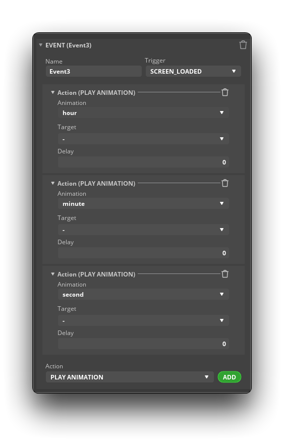
- Play Animation: You can play the animations created in the Animation Panel.
- Animation - The selected animation
- Target - Target widget you would like to use the animation on
- Delay - The delay time of the animation
- Set Opacity: The opacity of the selected widget.
- Set Flag: Set the value for the flag state of the widget.
- Set Property: Change the property value of the widget.
- Set text value from arc: Display the Arc Widget value on a Label Widget by using this action.
- Set text value from slider: Display the Slider Widget value on a Label Widget by using this action.
- Set text value when checked: Change the text of a Label Widget depending on the checked or unchecked state of the target object.
Panel Usage
To sum up, if I need to display the album image in the top half of the dial, then I need to adjust the coordinates and size of the Panel and set the background image.
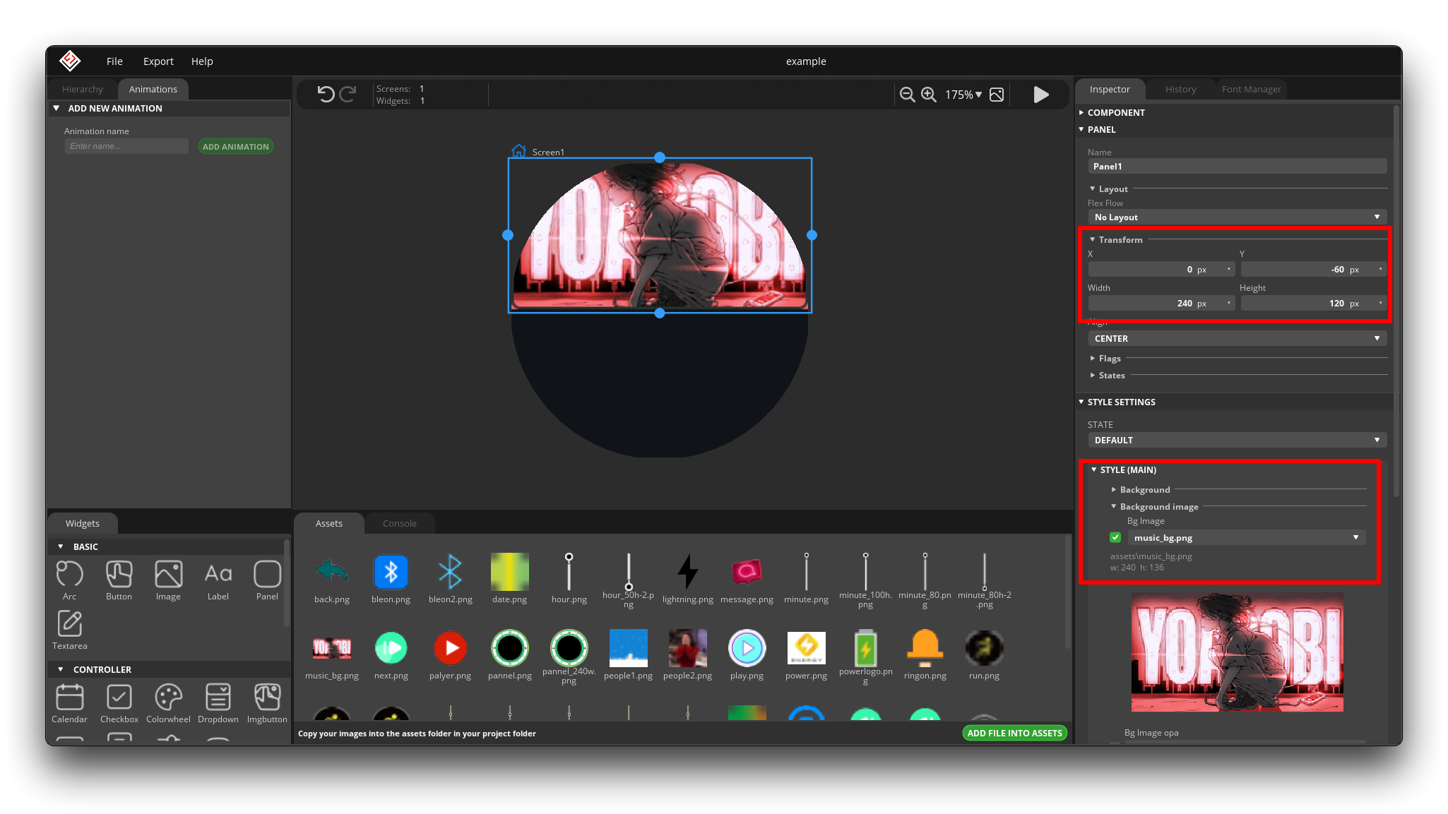
In order to occupy as little memory as possible on the motherboard, please insert the picture as much as possible to the resolution of the dial to compress, do not let go of the large picture!
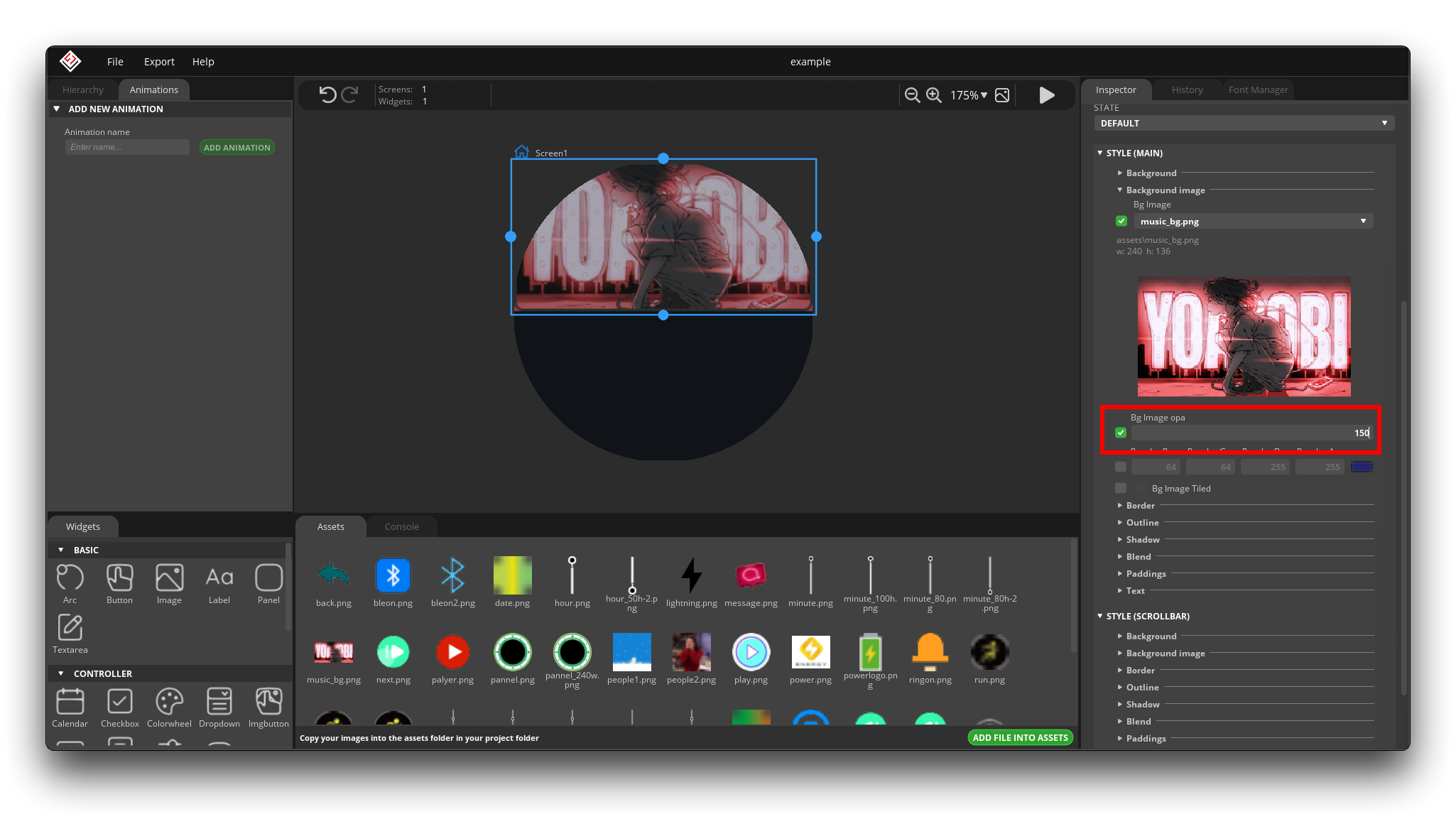
Then we can set the transparency of the image in Bg Image opa. I don't want it to be completely opaque because a completely opaque image will affect the display of my text afterwards.
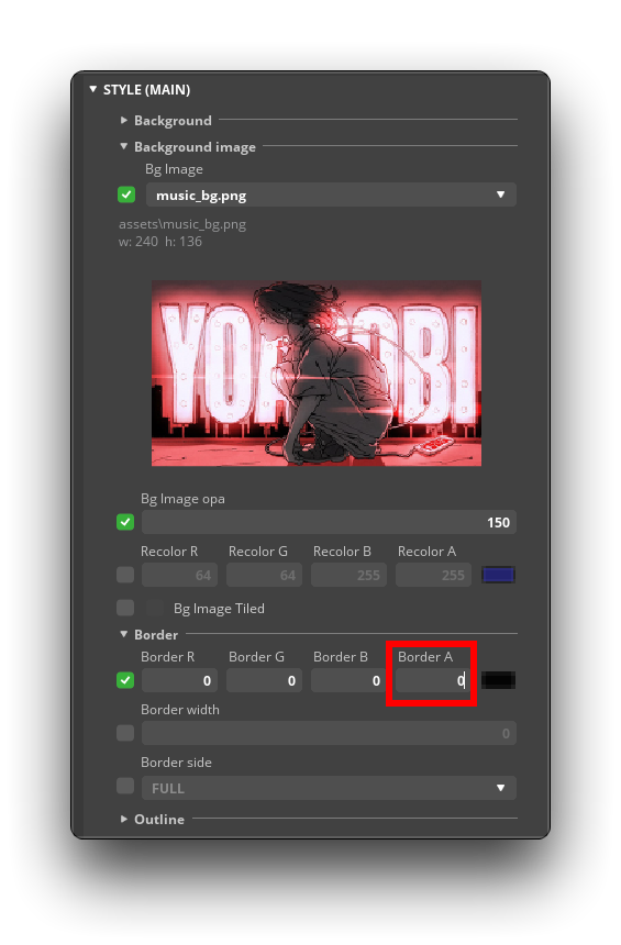
It is worth noting here that all components have frame lines by default, so in order not to affect the aesthetics, we need to remove the frame lines. The way to do this is to set the transparency of the Border color to 0.
So, if you want to remove any color or any line segment, you can do it by setting the transparency to 0.
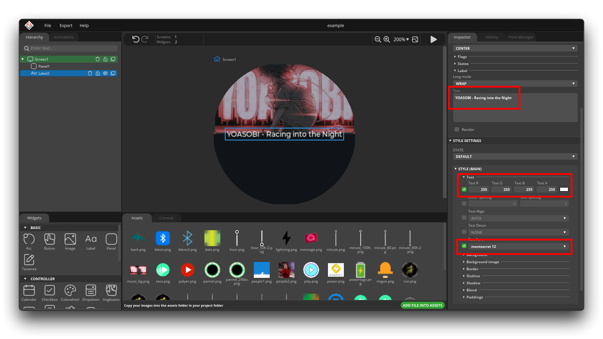
Label Usage
Then, we add text in the middle (use Label widgets), which shows the artist and the name of the song. In the style, we can change the font size, color and other content.
Imgbutton Usage
Under the text, we add some playback components (use Imgbutton widgets), such as play/pause button and toggle up/down track button.
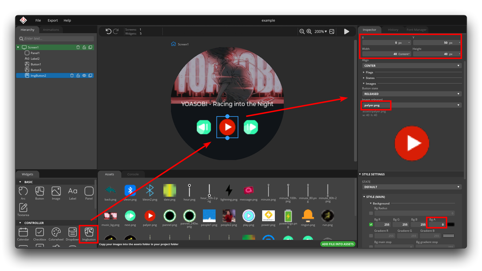
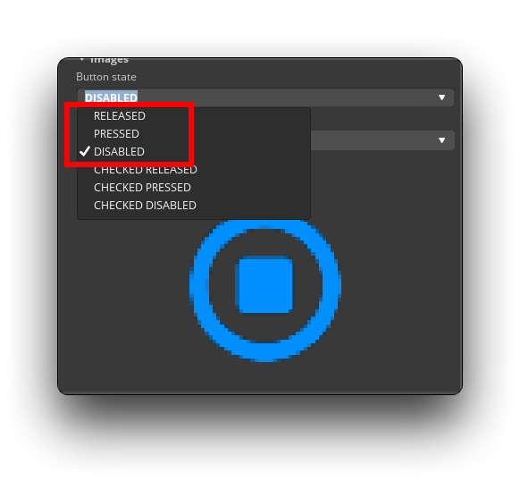
Imgbutton is a special kind of button, the biggest difference between it and the normal Button is that Imgbutton can be configured with three states of style before pressing the button, when pressing and after releasing the button respectively. This process is very similar to the scenario where we press to switch the play state. If you think the up/down button doesn't need such a complicated function, you can also use the Button directly.
Then we now set the Press and Release button images to the play style, and only in the Disable state is the pause style.
Then we add an event, the function of this event is, when the user presses the button, then the state switches to Disable, so that the effect of the image switch is achieved.
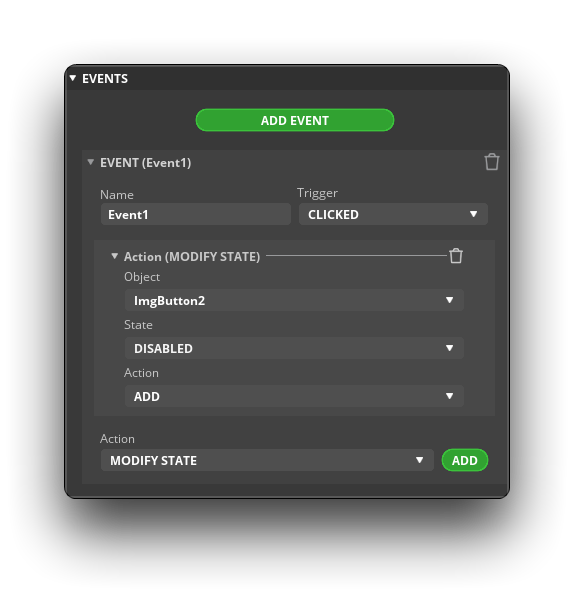
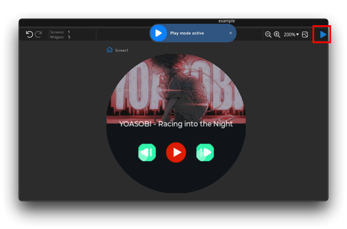
If you want to verify the effect, you can click on the play button at the top right of the workspace, and then you can click on the play button to see the effect of the switch.
Arc Usage
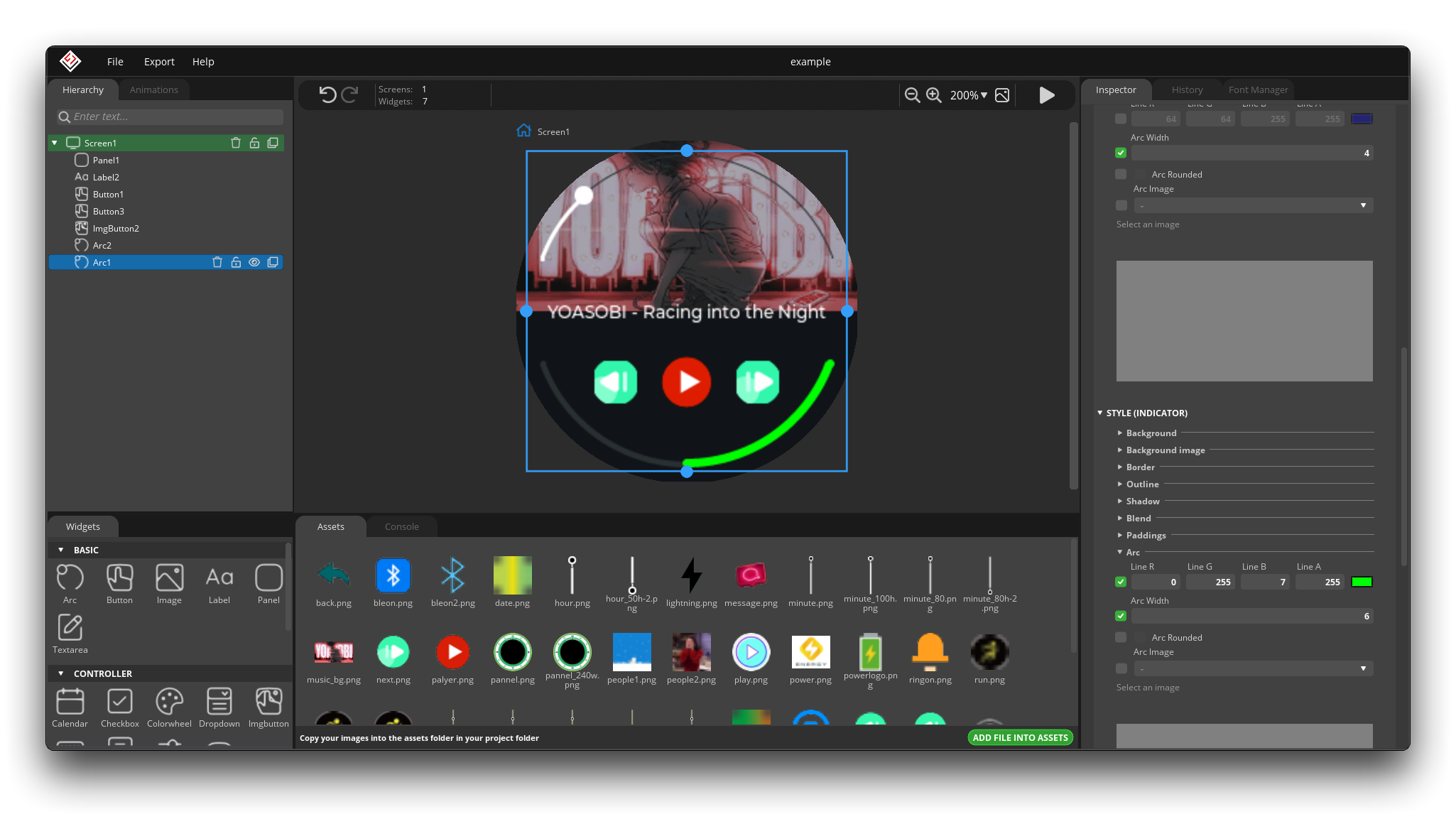
Then we add the last component, which is the volume bar and the playback progress bar. We'll do this by using Arc.
For Arc, the main things we need to adjust are the color and size of the rings.
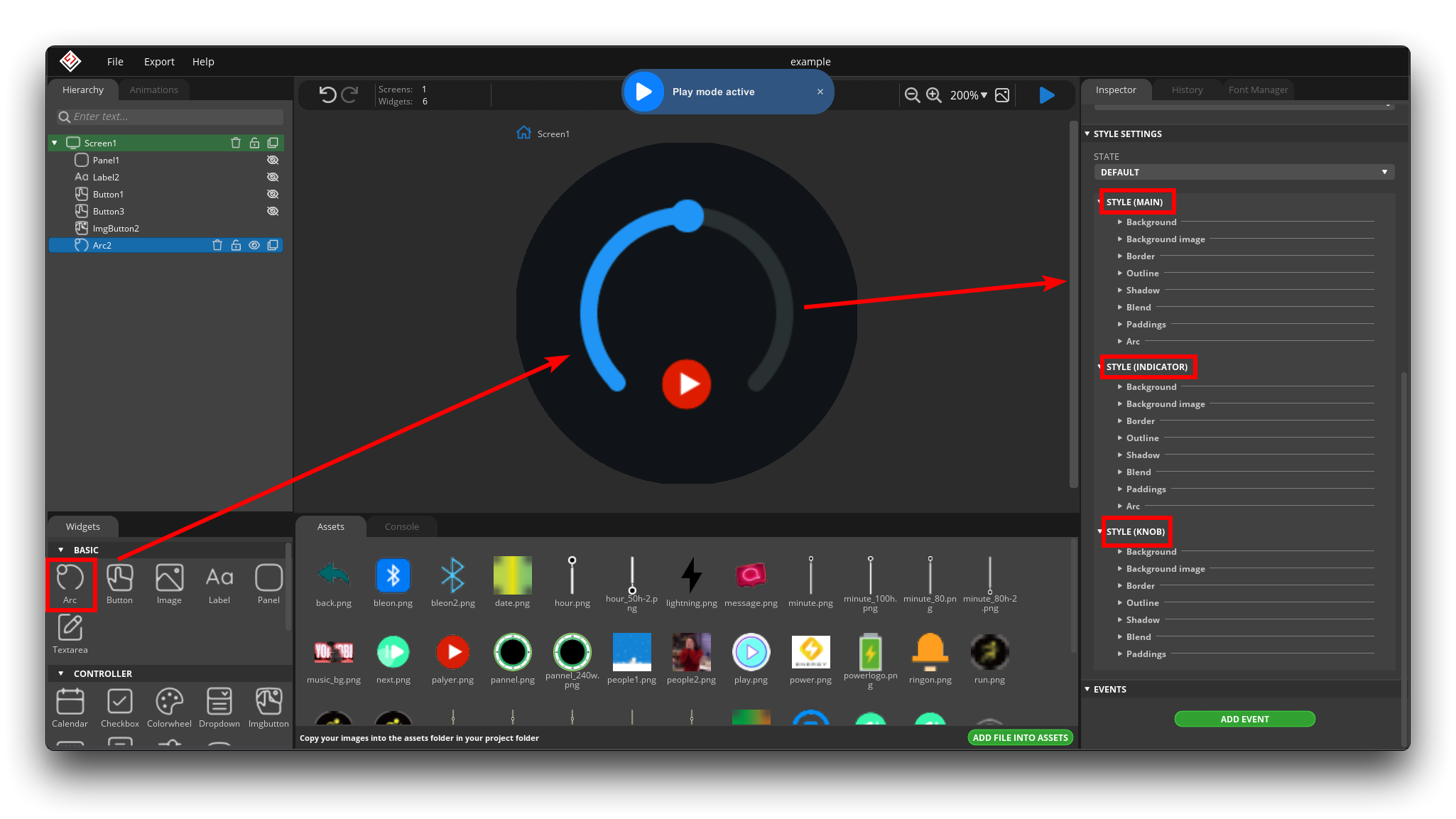
-
MAIN: This refers to the style design of the rectangular background behind the entire Arc. the Arc configured in the MAIN style is not indicative of the style of the arc area.

-
INDICATOR: Refers to the style setting of the arc of the starting indication area. The Arc setting under INDICATOR is generally used.

-
KNOB: This refers to the configuration of this circle on the image. If you don't need this circle, you can set its transparency to 0. The size of this circle, you need to set inside the Arc in INDICATOR.

This is the effect I want to achieve.
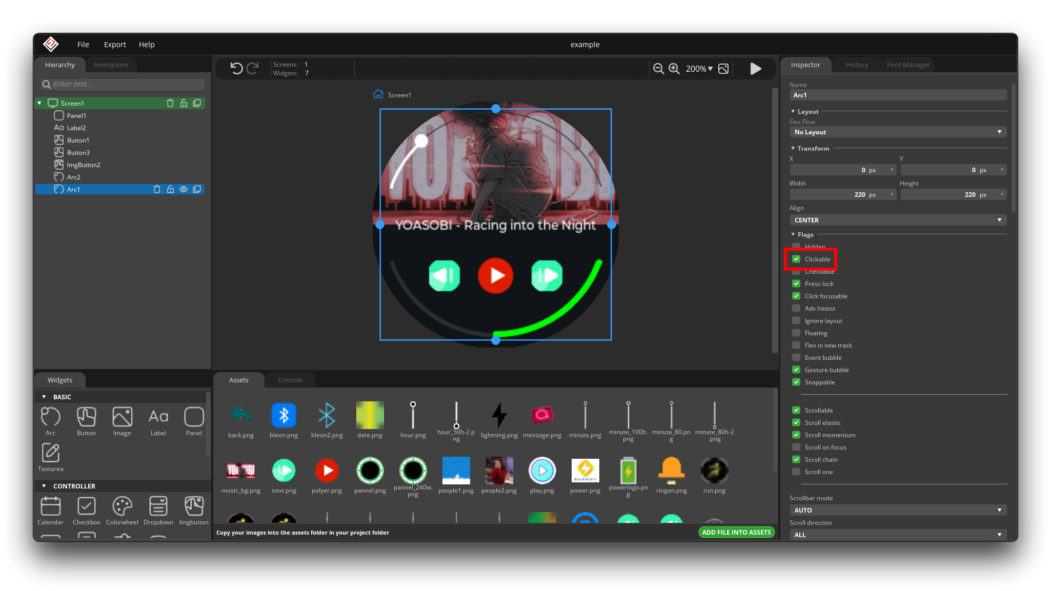
If you have checked that it is clickable, then you can click the Run button and drag the arc, then you can achieve the effect of changing the volume bar.
Screen Switch
With the music interface almost designed, we might as well add a new main interface next.
Then design an event that switches the main screen to the music screen. For example, I design it here to switch to the music playback interface by swiping my finger right under the main interface.
Since the main interface is the main character, this event should be added to the main interface under Screen.
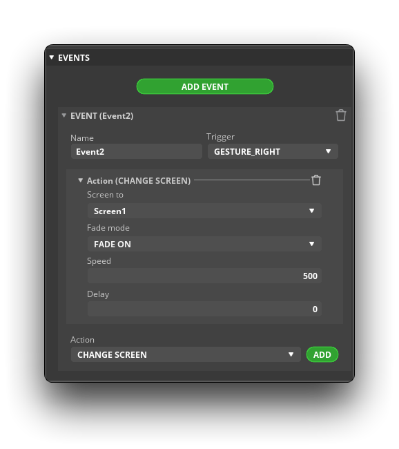
If you want to have an animation effect that slowly switches after a slide, then Speed you can keep at 500, if you want to switch immediately, then Speed should be set to 0.
Pointer Animation
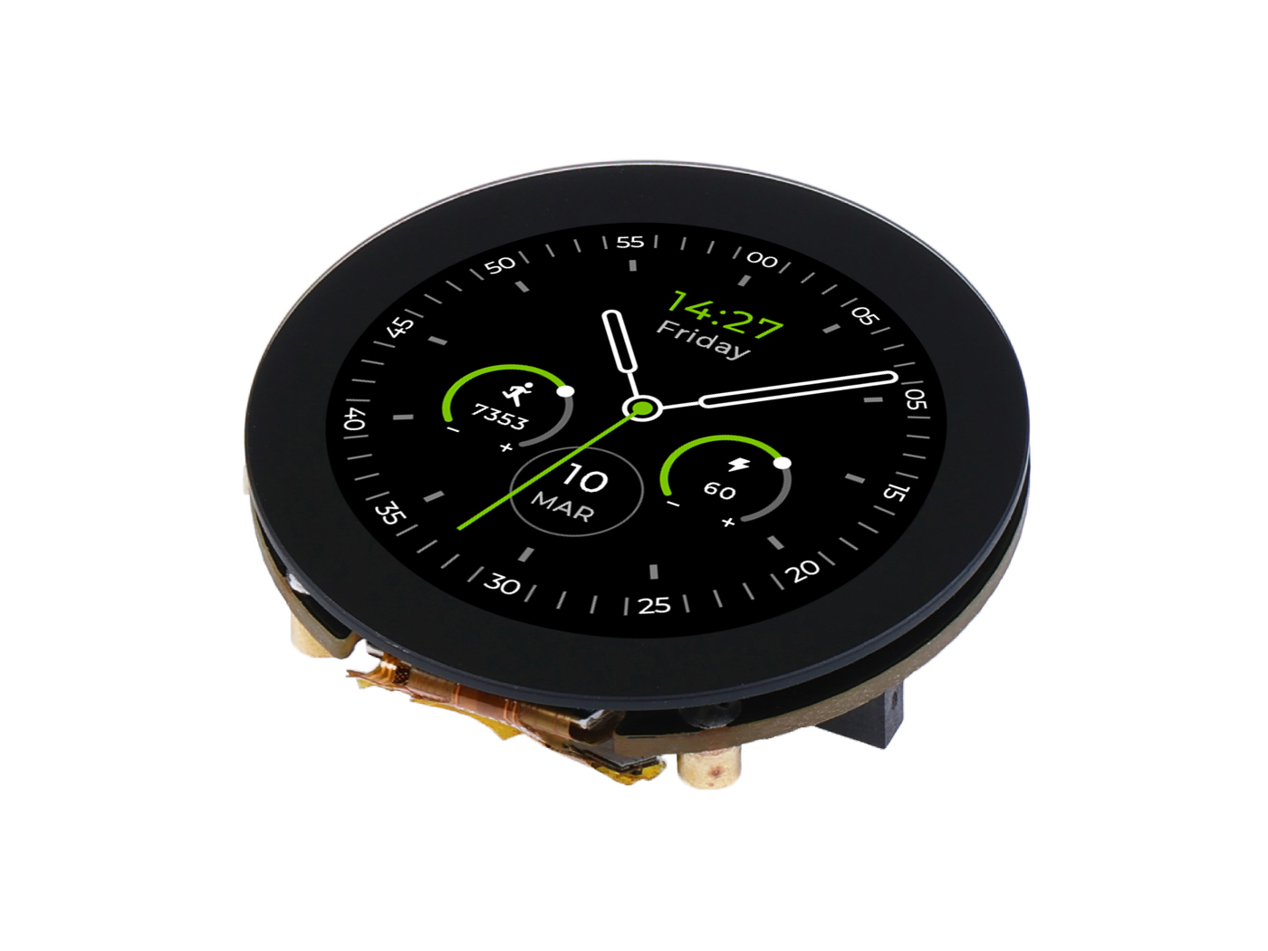
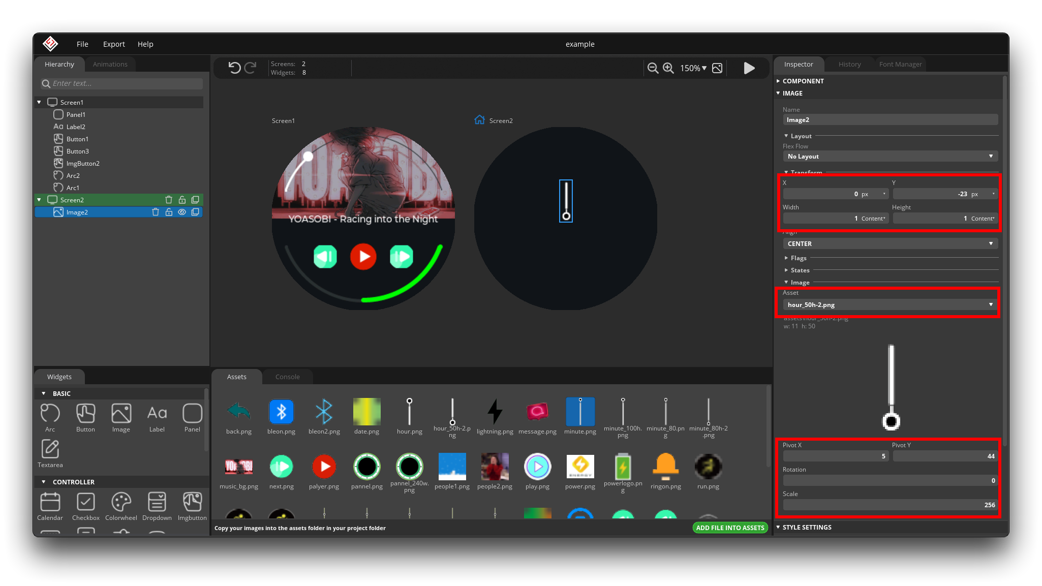
Back to the design of the main interface, we want to add the animation effect of the dial hand rotation.
The first thing to do is that you need to draw your own second, minute and hour hands. Then add it to the main dial in the style of Image.
The pointer position adjustment requires patience, as we need to make sure that the pointer is rotating around a fixed point on the picture.
Transform is set for image placement. The Pivot in the Image tab below sets the coordinates of the rotation point. The general way to set this is to first adjust the Transform to make sure the fixed point of the pointer is in the center of the dial, and then adjust the coordinates of the Pivot a little bit. When all the angles can make the pointer fixed point does not move, then these parameters are the most suitable.
Once you have all the pointer positions determined, you can start adding new animation effects. The animation effect settings for different pointers can be found in the following figure.
| Second | Minute | Hour |
|---|---|---|
 |  |  |
Finally, we just set the animation of the pointer movement to play while the main screen loads.
The above tutorials have basically covered 80% of the software usage scenarios, and many of the other components are very similar. Finally, here are some tips and hints for you when using the software.
-
You need to place all components with touch functionality at the top, otherwise it will interfere with the implementation of the component's touch functionality.
By default, the last component placed by the software is at the top. This means that in the Hierarchy tab, the components that are arranged next to each other tend to be at the top. In the music interface you just designed, the top layer is the Arc for adjusting the sound size, which causes a problem because the Arc is a rectangle that occupies the whole dial and will affect the touch of the play button, so normally you need to adjust the layer of the play button to the top of the Arc layer so that it will not affect the touch.

-
Turn off as many unneeded features as possible to save more memory.
Every component will have some Flags checked by default, but not all of them are required. while the default ones won't be a problem, turning off the unwanted Flags will make your dial UI run more smoothly.
Like the background album in the music interface, there is no need to click and no animation, and it is good to turn off the option in Flags. But close also need to consider the actual situation, for example, in the scene of sliding switch dial page, close the function of some Flags will make sliding disabled, so still need to run according to the effect of discretion to close.

-
Be sure to give a unique name to all your components and animations, events, etc.
The software can only save you the time of drawing some patterns and animations, but more complex effects may require you to program them later to achieve. Then it's important to be able to quickly find where your components are located in the code. Naming components, events and animations is key!
Step5. Export and application of programs
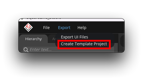
Once your dial UI is drawn, you can consider exporting the UI to a program and uploading it to XIAO via Arduino. Click on the top left corner of the software and click on Export -> Create Template Project.
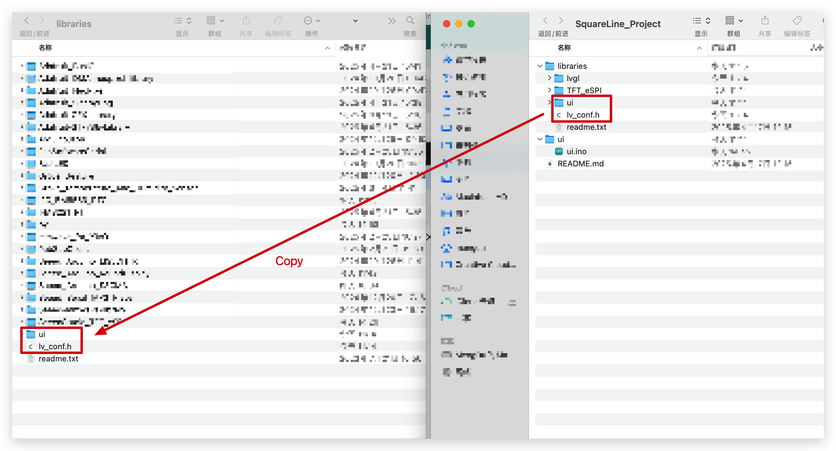
Then select the path to save and the code will be exported automatically. The exported project template will have the following files in it.
- libraries: This folder directory provides all the libraries you need to use in your project. For our tutorial, the lvgl and TFT_eSPI libraries in this directory are not needed, but the ui and lv_conf.h are useful for us.
- ui: Inside is the project program for Arduino, the .ino file.
- REANME.md
What we need to do, then, is to first put the required libraries and configuration files into the Arduino's libraries folder. Then modify the .ino file to make sure the functionality works.
Please copy the ui folder and the lv_conf.h file from the libraries folder directory exported by SquareLine Studio to the root directory of your Arduino library.
Then, we can open the .ino file directly under the ui folder. Then, we need to make changes to the following files to ensure that the program will compile smoothly.
- ui.ino:
| Descriptions | Screenshot | Code Segment |
|---|---|---|
| Defining the TFT library to be used and importing the round screen library |  | View Example Code |
| Comment out duplicate definitions of the tft class |  | View Example Code |
| Rewriting touch functions |  | View Example Code |
| Add Initialise screen function and initialise touch function |  | View Example Code |
| Screen rotate |  | View Example Code |
Then you can choose which XIAO you use to compile and upload.
About the LVGL library customization options
If you encounter an error message that some components are not defined after compiling, then you most likely did not replace the lv_conf.h file in the root directory of the Arduino library with the lv_conf.h file exported by SquareLine Studio.
To save memory on the motherboard, the lv_conf.h file default provide disables some of the lvgl features. But if you use these functions in your dial drawing, you need to turn them on manually.
- The default path for the
lv_conf.hon Windows systems is:
C:\Users\{UserName}\Documents\Arduino\libraries
- The default path for the
lv_conf.hon MacOS systems is:
\Users\{UserName}\Documents\Arduino\libraries
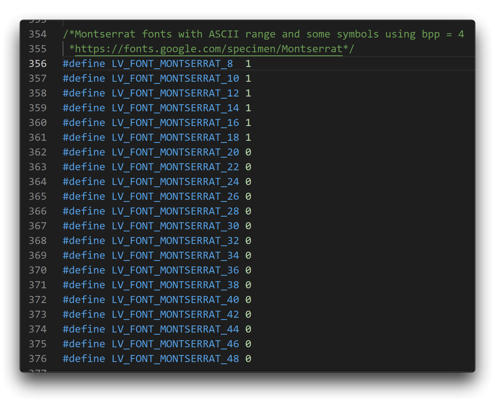
As a simple example, in the above example, we use the MONTSERRAT 8 font, but by default this font is turned off, so there may be an error during the compilation process.
Then all we need to do is to change the 0 after this font in the lv_conf.h file to 1, which means that the font is enabled.
If you encounter a similar error, you can double-check that the customization feature is enabled.
LVGL-based dial program
We have created two dial styles for the circular screen for users' reference. Due to the complex UI logic, this will require a certain amount of performance and memory on the XIAO motherboard. If your XIAO is compiling the following dial program with insufficient memory error, then you may need to upgrade your XIAO or reduce the functionality of the dials.
- Dial Style I:
Tech Support & Product Discussion
Thank you for choosing our products! We are here to provide you with different support to ensure that your experience with our products is as smooth as possible. We offer several communication channels to cater to different preferences and needs.